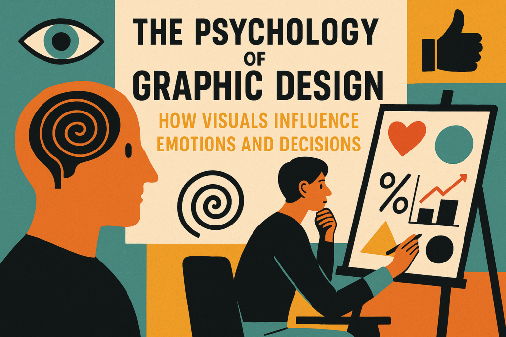
As aspiring graphic designers, we often focus on the aesthetic—the beautiful layouts, the perfect color palettes, the elegant typography. But what if I told you that the most impactful designs go far beyond mere aesthetics? They tap into something deeper: the human mind. Welcome to the fascinating world of The Psychology of Graphic Design: How Visuals Influence Emotions and Decisions in Graphic Design., where we explore how visuals subtly (and sometimes not so subtly) influence our emotions, perceptions, and ultimately, our decisions. Understanding this is not just a fascinating academic exercise; it’s a superpower for designers, so Master Graphic Design Course in Digitalents Academy as we are one of the best graphic design institute in Bangalore.
Why Does Design Psychology Matter?
Think about it: every brand, every advertisement, every website, and every app is trying to evoke a specific response from its audience.
- Do they want you to feel trustworthy and secure?
- Do they want to ignite excitement and urgency?
- Are they aiming for a sense of calm and luxury?
The answer lies not just in the words they use but profoundly in the visual language they employ. For designers, mastering this means creating work that doesn’t just look good but works—achieving its intended purpose with greater precision and impact.
Key Psychological Principles at Play in Design
Let’s dive into some core psychological principles and how they manifest in the visual world:
1. Color Psychology: The Emotional Palette
This is perhaps the most well-known aspect of design psychology. Different colors evoke different emotions and associations, often culturally influenced and The Psychology of Graphic Design: How Visuals Influence Emotions and Decisions in Graphic Design.
- Blue: Trust, security, professionalism, calm (think financial institutions, tech companies).
- Red: Passion, urgency, excitement, danger (often used in sales, food, and automotive).
- Green: Nature, growth, health, wealth (eco-friendly brands, health products).
- Yellow: Happiness, optimism, warmth, caution (children’s brands, caution signs).
- Black: Sophistication, luxury, power, mystery (high-end fashion, luxury cars).
- White: Purity, simplicity, cleanliness, minimalism (healthcare, bridal, tech).
Design Tip: Don’t just pick a “pretty” color. Consider the emotional message you want to convey and research your target audience’s cultural associations with that color.
2. Typography: The Voice of Your Message
Beyond readability, typefaces carry immense psychological weight. They communicate tone, personality, and trustworthiness.
- Serif Fonts (e.g., Times New Roman): Often convey tradition, authority, respectability, and classic elegance. Great for formal documents or established brands.
- Sans-Serif Fonts (e.g., Helvetica, Arial): Project modernity, simplicity, cleanliness, and approachability. Popular for web design and contemporary brands.
- Script Fonts: Suggest elegance, creativity, personal touch, or luxury.
- Display Fonts: Used for impact, specific themes, or headlines; highly expressive but less readable for body text.
- Design Tip: The font you choose should align with the brand’s personality and the message’s emotional intent. A playful script font for a law firm might send mixed signals!
3. Shape Psychology: The Unseen Language of Forms
The shapes we use in logos, layouts, and iconography also have inherent psychological associations.
- Circles: Wholeness, unity, community, softness, protection (e.g., Rings, globes, many social media logos).
- Squares/Rectangles: Stability, strength, order, reliability, professionalism (e.g., Buildings, financial institutions).
- Triangles: Direction, power, energy, innovation, hierarchy (e.g., Play buttons, arrow indicators, some automotive logos).
- Organic/Curved Shapes: Nature, comfort, creativity, fluidity, approachability.
- Design Tip: Consider how the dominant shapes in your design contribute to the overall feeling. Sharp angles can feel aggressive, while soft curves feel welcoming.
4. Visual Hierarchy: Guiding the Eye and Mind
Our brains are designed to seek efficiency and order. Visual hierarchy is the strategic arrangement of elements to dictate their importance and guide the viewer’s eye.
- Size: Larger elements draw more attention.
- Color & Contrast: Bright, contrasting colors stand out.
- Placement: Elements at the top or center often get the first impression.
- Whitespace: Ample empty space around an element can make it appear more significant and luxurious.
- Design Tip: Use hierarchy to tell a story. What’s the most important piece of information? Make sure it’s the first thing the viewer sees and understands.
5. Gestalt Principles: The Whole is Greater Than the Sum of its Parts
The Gestalt principles describe how humans naturally perceive visual information as organized wholes rather than individual parts.
- Proximity: Elements close together are perceived as a group.
- Similarity: Elements that look alike (color, shape, size) are perceived as related.
- Continuity: The eye follows lines and curves.
- Closure: Our brains will fill in the gaps to create a complete image.
- Figure-Ground: Distinguishing a foreground element from its background.
Design Tip: Leverage these principles to create cohesive, intuitive, and visually pleasing compositions that guide the viewer’s interpretation effortlessly.
Putting Psychology into Practice
Understanding these principles isn’t about manipulating people; it’s about communicating more effectively and empathetically. When you design with psychology in mind, you’re not just making something look good—you’re crafting an experience that resonates on a deeper level.
- As you embark on your graphic design journey, always ask yourself:
- What emotion do I want to evoke with this design?
- What action does the user want to take?
- How can I use color, typography, shape, and layout to achieve that goal?
Conclusion
By consciously applying the psychology of design, you’ll transform from someone who simply makes things look good to someone who truly understands how to influence and connect through powerful visuals.